


Core Web Vitals Case Study in Multifamily: Impact on Website UX & Rankings

Table of Contents
The term “Core Web Vitals” (CWV) gets thrown around a lot in marketing meetings. We’re told they’re important for SEO, crucial for user experience, and a key factor in Google’s rankings. But what does that actually mean for a multifamily property website?
To cut through the noise and answer these questions with real numbers, the Agency FIFTY3 data team launched a massive, year-long study. We analyzed 7,297,440 user sessions across 120 unique multifamily websites to measure the true impact of Core Web Vitals (CWV) on user experience, organic rankings, website engagement, and, most importantly, conversion rates.
And this isn’t simulated data from a testing tool. We leveraged Google’s official developer tools to collect real-time CWV data directly from actual users on a wide variety of devices and network connections.
In this definitive core web vitals case study, we’ll give you a high-level overview of what CWV are, show you how to read our findings, and dive deep into the data to answer the ultimate question: Do Core Web Vitals really impact your website’s rankings and user experience?
Key Takeaways
- CLS (Cumulative Layout Shift) had a negative moderate correlation with Engagement Rate ( r = -0.470 )
- The CWV with the strongest overall impact on UX is CLS. Underperforming CLS is easily noticeable to users and seems to cause the most frustration.
- INP (Interaction to Next Paint) had the largest amount of accounts in the “poor” category, at 34.5%
- Optimizing for Core Web Vitals has a slight impact on UX, and in SEO , where small incremental progress matters, it’s important to make sure your CWV are not hindering your website’s UX.
Core Web Vitals Overview
In June 2021, Google officially made Core Web Vitals a ranking factor in its organic algorithm. While page speed was always a known best practice, this update put a new set of user-centric metrics front and center for digital marketers.
Fast forward to March 2024, and Google has already refined the formula. The metric First Input Delay (FID) was replaced with a more comprehensive measure of website responsiveness: Interaction to Next Paint (INP).
Core Web Vitals are a specific subset of performance metrics that represent three distinct aspects of the user experience: loading, interactivity, and visual stability. Google’s standards for a “good” experience are clear and measurable.
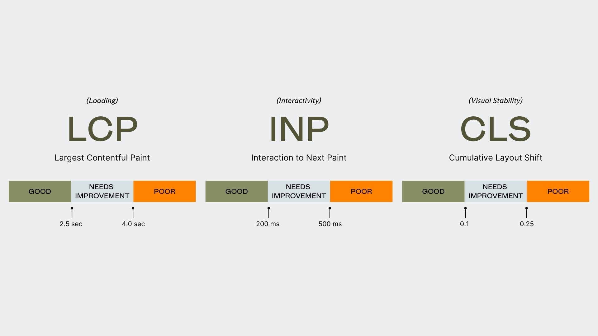
- Largest Contentful Paint (LCP): Measures loading performance. To provide a good user experience, your page’s main content should load within 2.5 seconds.
- Interaction to Next Paint (INP): Measures interactivity. To provide a good user experience, your page should respond to user input (a click or tap) in 200 milliseconds or less.
- Cumulative Layout Shift (CLS): Measures visual stability. To provide a good user experience, your page should have a CLS score of 0.1 or less.
How To Read The Core Web Vitals Study
We visualized the relationship between each of the three Core Web Vitals (LCP, INP, and CLS) and five key website performance metrics:
- Conversion Rate (from Google Analytics 4)
- Session Duration (from Google Analytics 4)
- Views Per Session (from Google Analytics 4)
- Engagement Rate (from Google Analytics 4)
- Organic SERP Position Average for Non-branded Keywords (from Google Search Console)
For each CWV, we’ll show you the percentage of the 120 multifamily websites that fell into Google’s “good,” “needs improvement,” and “poor” ranges. Then, we’ll break down how that CWV metric correlates with our performance metrics.
To do this, we use scatter plots and the Pearson Correlation Coefficient (r), a statistical measure that shows the strength and direction of a relationship between two variables. The coefficient ranges from -1.0 to +1.0.
Here’s a simple guide to interpreting the ‘r’ value:
- Strong Correlation (0.7 to 1.0 or -0.7 to -1.0): The variables move together consistently.
- Moderate Correlation (0.3 to 0.69 or -0.3 to -0.69): A noticeable relationship, but with some variability.
- Weak Correlation (0.1 to 0.29 or -0.1 to -0.29): A slight tendency for variables to move together, but the relationship is not strong.
- No Correlation (0 to 0.09 or 0 to -0.09): The variables have no linear relationship.
With the ground rules set, let’s dive into our first metric: Largest Contentful Paint.
Largest Contentful Paint (LCP)
LCP measures the time it takes for the largest single element – usually a hero image, video, or large block of text – to become visible on the screen. This metric is a proxy for perceived load speed; it tells you how quickly a user sees that your page is actually loading something substantial.
For LCP, our study found that the majority of multifamily websites earned a “good” rating.
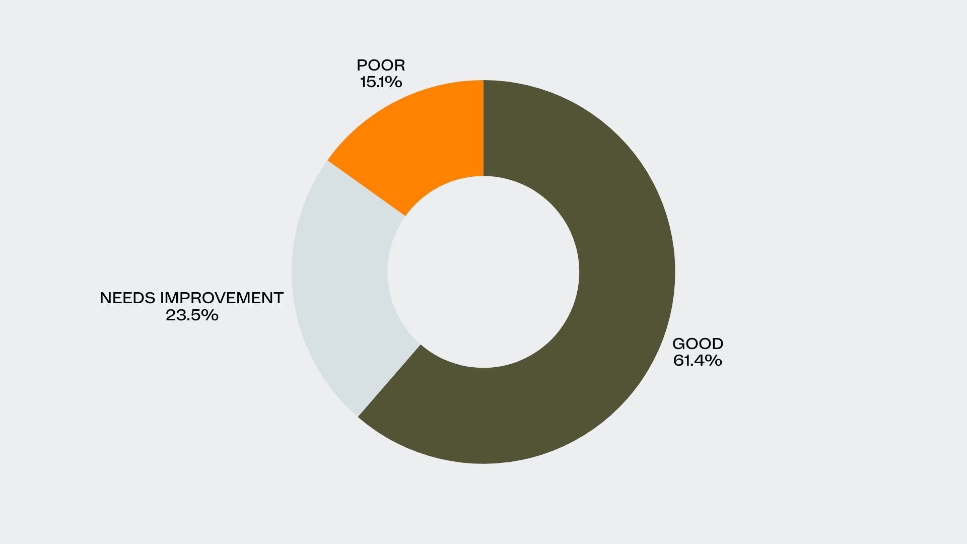
- Good: 61.4%
- Needs Improvement: 23.5%
- Poor: 15.1%
These results are squarely in the middle of the pack, not the best-performing CWV metric, but certainly not the worst. Now let’s look at how LCP correlates with key performance indicators.
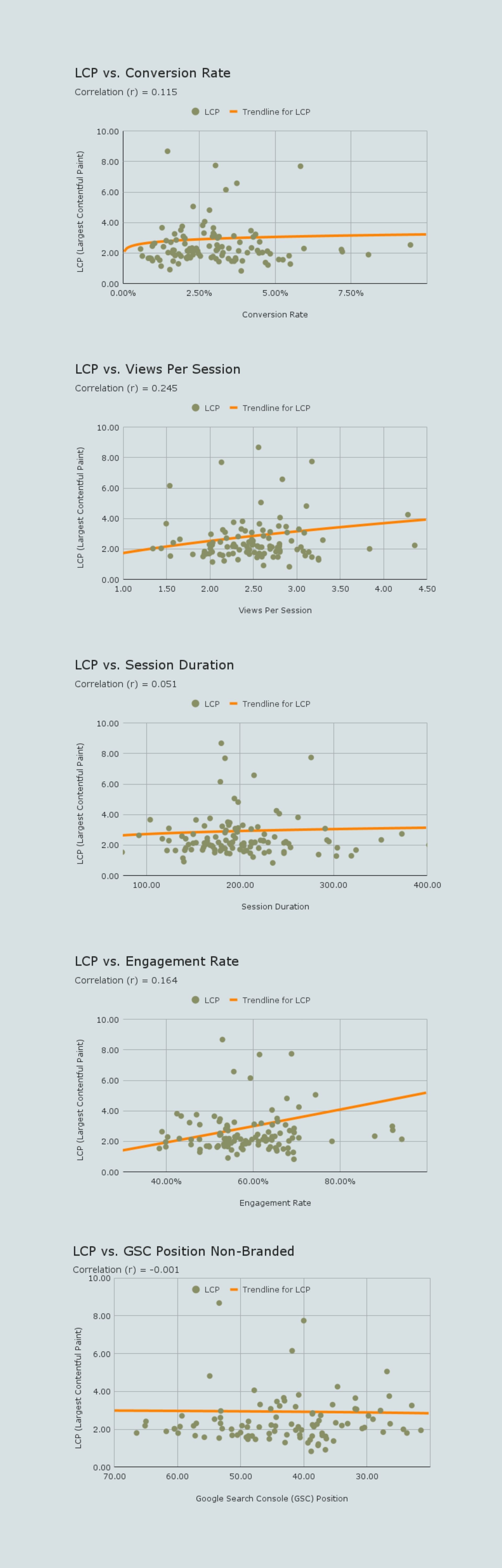
Our analysis found that LCP had a weak positive correlation with Conversion Rate (r = 0.115) and Engagement Rate (r = 0.164), and very little to no correlation with Session Duration (r = 0.051), Views Per Session (r = 0.245), or Google Search Console Position (r = -0.001).
The weak positive correlations suggest that a faster initial load time does contribute to a slightly better user experience, encouraging visitors to engage a bit more. This makes sense for a few reasons:
- First Impressions: A fast LCP signals that the site is modern and well-maintained, building immediate trust.
- Reduced Cognitive Load: Users can instantly focus on your content instead of being distracted by a loading animation.
- Setting Expectations: A fast initial load creates a positive halo effect. If the first thing a user sees loads quickly, they expect the rest of their journey to be just as smooth.
However, LCP is only one piece of the puzzle. Often, smaller elements load before the largest one, so the user perceives the page as loading even if the LCP score itself isn’t perfect. A fast LCP is good, but don’t expect it to single-handedly boost engagement.
Cumulative Layout Shift (CLS)
CLS measures the visual stability of a page by scoring any “unexpected” shifts in the layout that occur as the page loads.
Think about it: you go to tap a button on your phone, but right as your finger makes contact, a banner loads at the top, pushing the entire page down. You accidentally tap an ad instead. That frustrating experience is exactly what CLS is designed to measure.
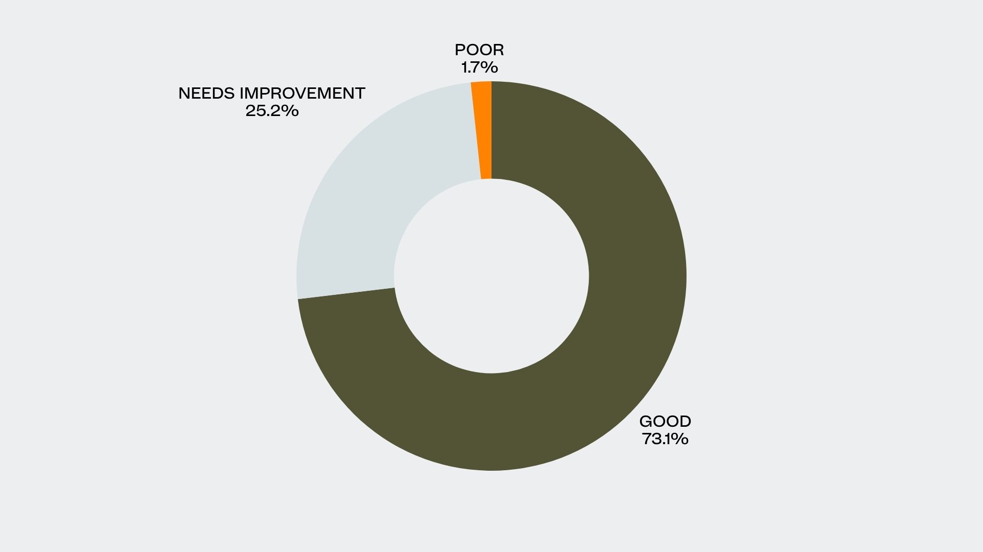
- Good: 73.1%
- Needs Improvement: 25.2%
- Poor: 1.7%
In our analysis, CLS was the best-performing metric, with the largest number of websites in the “good” range and the fewest in the “poor” category.
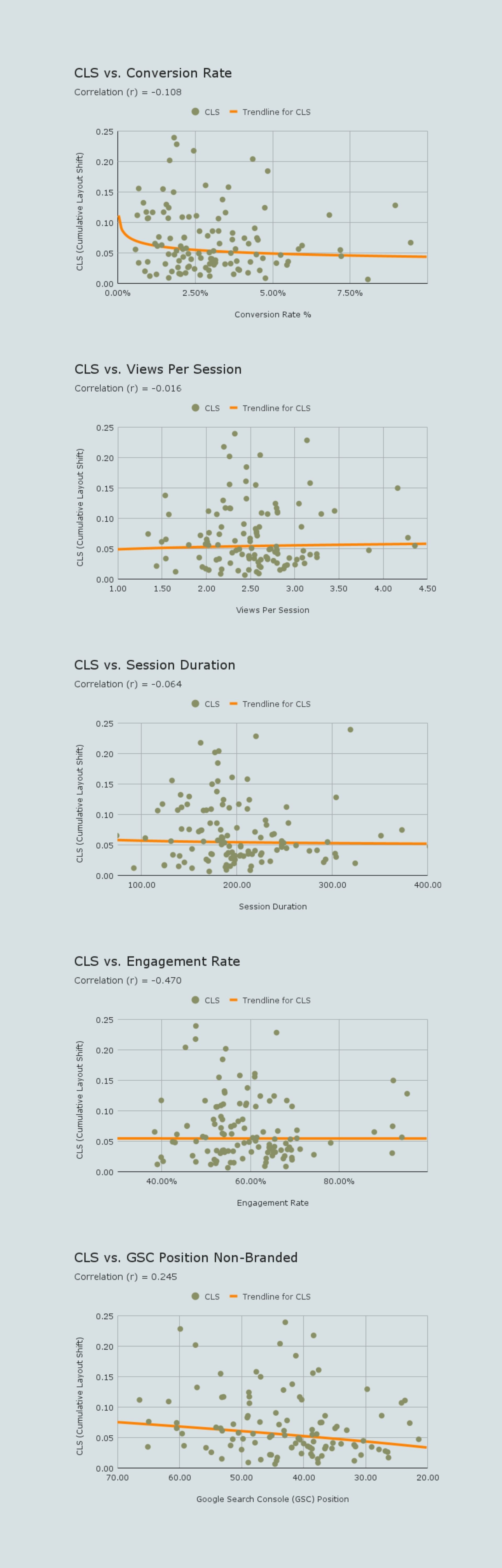
Here’s where things get interesting. Our core web vitals case study found that CLS has a moderate negative correlation with Engagement Rate (r = -0.470). It also showed a weak negative correlation with Conversion Rate (r = -0.108) and a weak positive correlation with GSC Position (r = 0.245).
That moderate negative relationship is significant. It means as visual instability increases, user engagement tends to drop. When things jump around on the page, users get frustrated and are far less likely to stick around or convert. This isn’t just a theory; it’s a visceral human reaction.
- Loss of Control: Sudden layout shifts disrupt a user’s mental map of the page, creating a sense of unpredictability.
- Increased Cognitive Load: Users have to waste mental energy reorienting themselves just to find where they were on the page.
- Negative Brand Association: A jumpy, unstable website can feel unprofessional or poorly built, eroding trust. This is why a commitment to professional multifamily website design is not just about aesthetics, but about core functionality and user confidence.
- Startle Response: Unexpected movement on a screen can trigger a primal, negative reaction.
Of the three Core Web Vitals, CLS has the most direct and noticeable impact on users. It makes perfect sense that this metric shows the strongest correlation with user behavior, it’s the easiest one for a visitor to perceive as a negative experience.
Interaction to Next Paint (INP)
INP is the newest Core Web Vital, designed to assess a page’s overall responsiveness. It measures the delay between a user’s action—a click, a tap, or a key press—and the moment the page provides a visual response. A poor INP score means your website feels sluggish and unresponsive.
When calculating INP, only three interaction types are observed:
- Clicking with a mouse.
- Tapping on a touchscreen device.
- Pressing a key on a physical or virtual keyboard.
INP was the worst-performing metric in our study, with over a third of multifamily websites falling into the “poor” category.
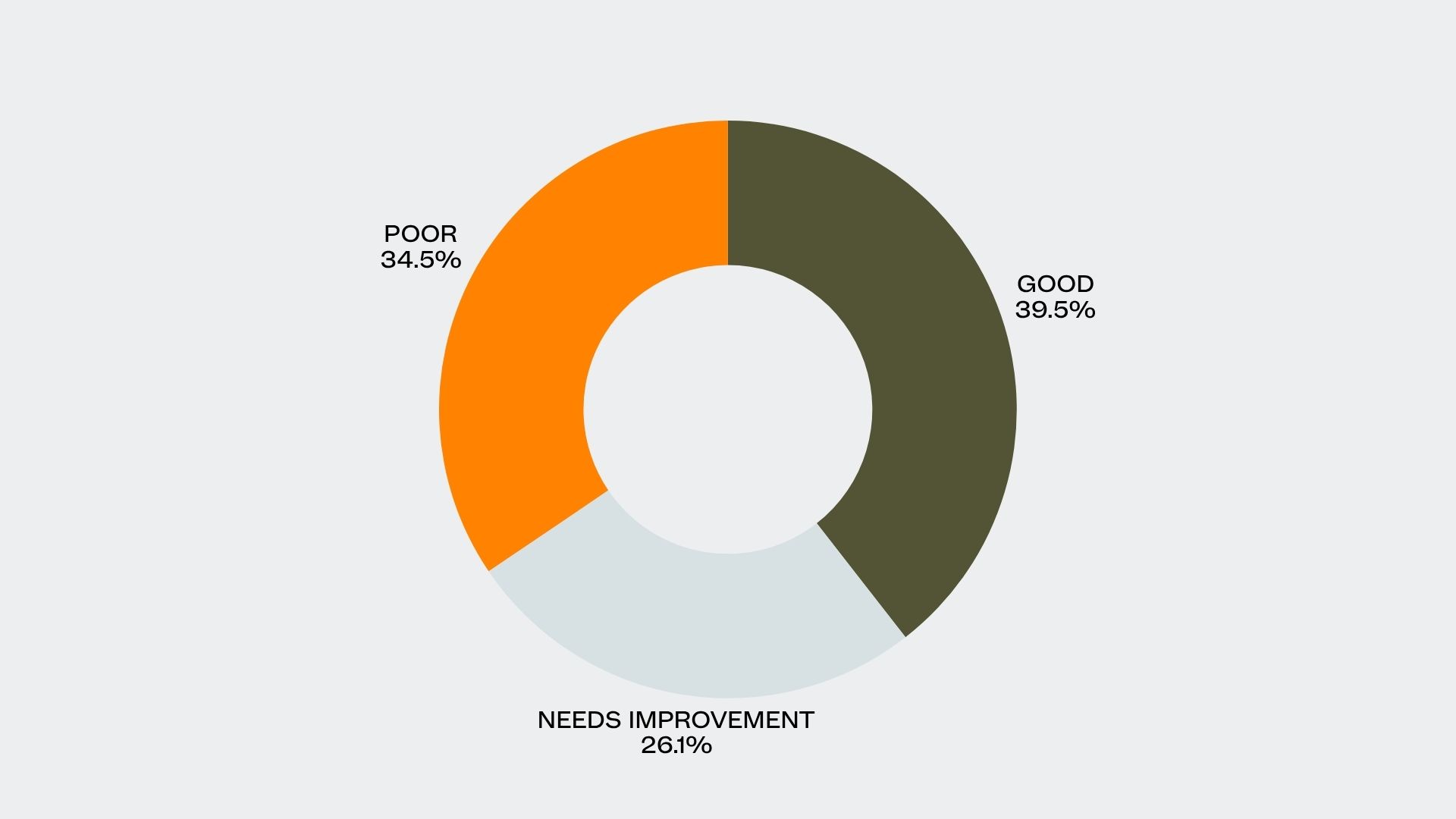
- Good: 39.5%
- Needs Improvement: 26.1%
- Poor: 34.5%
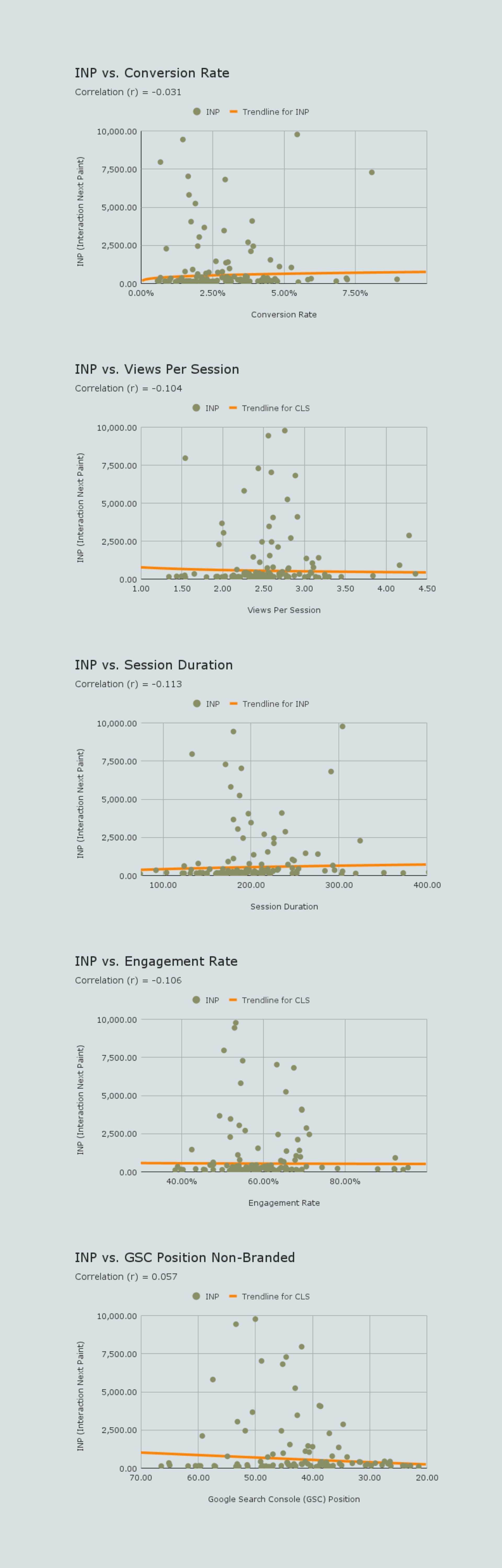
INP showed weak negative correlations with Engagement Rate (r = -0.106), Session Duration (r = -0.113), and Views Per Session (r = -0.104). There was no meaningful correlation with Conversion Rate or GSC position.
These weak negative trends suggest that users are slightly less likely to engage with or explore a website that feels unresponsive. The impact is more subtle than with CLS, but it’s still present.
- Perceived Unresponsiveness: A high INP creates a feeling of frustration, as if the website isn’t listening to the user’s commands.
- Erosion of Trust: Unresponsive sites can feel broken or unreliable, causing users to question the quality of the property itself.
- Interaction Hesitancy: If users encounter laggy interactions, they may become more hesitant to continue navigating the site.
- Subconscious Frustration: A user might not consciously think, “This site has a high INP,” but they will subconsciously feel impatient and develop a negative association.
Delays in user interactions subtly discourage further exploration. While not directly tanking conversions or rankings on its own, a poor INP score contributes to an overall feeling of a low-quality user experience.
Why Small Victories Matter in SEO
Core Web Vitals are a direct measure of how users experience your website’s performance. Our analysis of over 7 million user sessions revealed that while the connections between CWV and macro-goals like conversion rates are often weak, you cannot afford to ignore these metrics.
If your site scores in the “needs improvement” range, it’s not an emergency. However, a consistent “poor” score is a clear signal that your website’s performance is actively frustrating users. Over time, this will degrade your overall performance.
This is the central takeaway from our core web vitals case study: in the hyper-competitive world of multifamily marketing, every small advantage matters.
Improving your Core Web Vitals, even for a slight gain, is one more way to optimize your website beyond your competitors. In markets where every lease is a battle, these incremental optimizations can collectively make a significant difference in search rankings and user satisfaction. Ignoring CWV means leaving potential gains on the table.
Ultimately, while the direct impact of any single CWV score might be small, their cumulative effect is undeniable. A technically sound website with good Core Web Vitals provides a better user experience, and a better user experience is fundamental to better performance across the board.
Ready to turn these incremental gains into a measurable market advantage? Contact Agency FIFTY3 today.

Sign up for our newsletter.
Stay in the know about our insights and industry trends.