Onshore
Project Overview.
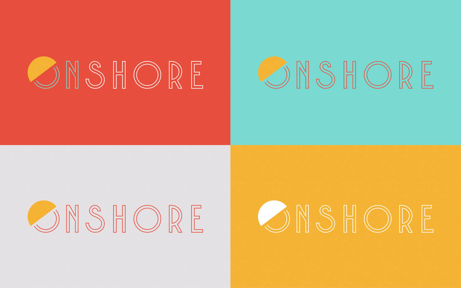
Onshore is a student housing community in Daytona Beach, Florida. They came to us for a trendy brand overhaul. Our design team worked with Onshore to develop a logo and brand collateral that honored their tropical destination while creating elements to make the property stand out amongst all the beach-themed properties in the area.

Building the brand.
Onshore wanted a brand that reflected their “City Spirit, Coastal Roots” tagline in a way that was modern, stylish, and upbeat. We used this inspiration to create a tasteful, beach-inspired logo with a sunrise concept incorporated into the O of Onshore. The type-face, Brodo, was specifically requested by the client. It’s modern in its vertical stress, double struck type, and rounded style, so it worked as a friendly, modern choice to catch the eyes of a student audience. The color palette––a modestly saturated red, orange, blue, and white––reflects the colors of a warm sunset complemented by a teal-tinged shade of blue to honor ocean waters. With an emphasis on colorful geometric shapes, the logo was created to be highly versatile, allowing us to translate the primary logo into uniform—yet fun and head-turning—design variations throughout brand collateral.
In trusting us implicitly with their bright and eclectic brand aesthetic, the client gave us the freedom to create a cohesive brand identity, entirely unique to Onshore, that allowed them to stand out from their competition. The result was a vibrant and one-of-a-kind brand identity that tied to the beach––fun, vibrant colors and all––without fading into the overt and all-too-common beach themes of other brands throughout Daytona Beach.
